The umbilical cord that binds Satyajit and the Bauhaus movement is almost invisible, apparently considered a matter of sheer speculation or a study in serendipity. Why on earth should we grope and find shades of similarity in the works of Ray and Staatliches Bauhaus, a school initiated in 1919 by Walter Gropius dedicated to unite all branches of the arts under one roof? Ray himself never explicitly mentioned it as an influence in any of his interviews although he regularly subscribed to design magazines like Graphis or Gebrauchsgraphik Magazine [1] which openly celebrated the Bauhaus aesthetic.
As a student of Kala Bhavan [2], he was definitely acquainted with the nuances of the movement. In fact, Bengal had an early association with Bauhaus through the intervention of the Austrian art historian Stella Kramrisch, who taught Indian and European Art at Santiniketan from 1921 to 1923. She invited the Bauhaus to send some representative paintings and graphics for a joint exhibition with leading Indian artists from the Bengal School. The ‘Bauhaus in Calcutta’ [3] exhibition in December 1922 has often been referred to as an entry point of modernism in India. It opened on the occasion of the 14th Annual Exhibition of The Indian Society of Oriental Art in Calcutta at the Samavaya Mansions. It was a unique event with works by the Bauhaus artists Paul Klee, Lyonel Feininger and Johannes Itten presented alongside paintings by modern Indian artists such as Nandalal Bose, Abanindranath Tagore, Sunayani Devi and Gaganendranath Tagore. This was also an encounter of artistic and intellectual affinities – between Western modernism searching for spiritual and artistic renewal after the First World War and Indian artists striving for cultural emancipation in late-colonial India. In terms of the Bauhaus influence on architecture, the pioneering work of Habib Rahman who joined West Bengal PWD just before independence left a mark on the predominantly colonial skyscape of Kolkata. Before he left for Delhi in 1853, Rahman undertook 80 projects in Bengal which included student housing and several training academies for the police services, the huge new campus of the Bengal Engineering College and, most importantly, the West Bengal Government’s New Secretariat Building — India’s first steel frame skyscraper. There are sly references to those new kind of architectural style in Ray’s urban films, notably Mahanagar.
Ray’s graphic design is also peppered with subliminal Bauhaus influences. The idea of “gesamtkunstwerk”, or “synthesis of the arts”, borrowed by Gropius from composer Richard Wagner, envisioning a school that united every discipline, architecture and sculpture and painting would ideally sound enticing to young Satyajit, already seeped in myriad Western influences. The design philosophy of Bauhaus is that form follows function. In other words, Bauhaus is based on a no-frills, no-gimmicks approach that favours utility over mere display of visual aesthetics. The Bauhaus grammar of minimalism — a triangle, a square, and a circle — evoked a back-to-the-basics mentality. It is a kind of geometrical clarity that we see in many of the works done by Ray. However, there is a note of caution here. Ray’s stint at Kala Bhavana where he was exposed to the wonderful tradition of Indian art also tempered his ideas of a pure minimalist outlook. So, Ray is unlikely to be completely taken in by the dictum of Gropius who instructed students to leave behind sentimental, aesthetically decorative conceptions drawn mostly from past cultures. It is true that Ray, looked at his life as a designer as one who is almost driven to it by certain functional needs — whether as a visualiser at D.J. Keymer or a book-maker at Signet Press or a designer who created publicity materials for his films or an illustrator as an editor of Sandesh and his own story books. However, the artist in him always looked for ways to subvert pure utilitarianism and create a new idiom which is spiritually integrated to his artistic vision. So, in my mind, he tried to do a balancing act and fused form/function to his aesthetic worldview.
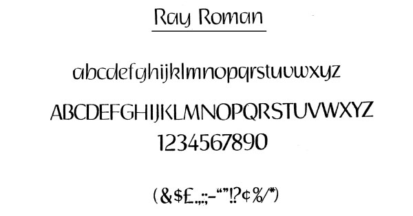
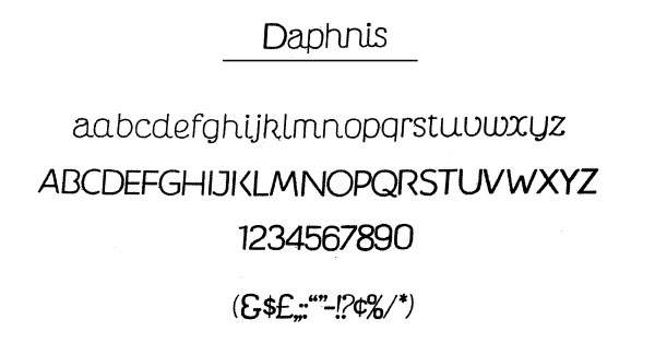
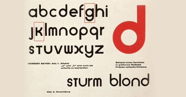
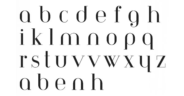
It is difficult to make an entire list of his designs that may have certain Bauhaus influence within this short space but even one or two examples could be a valid starting point. Very few concrete things have been said about Ray’s typography. Satyajit created 4 English typescripts — ‘Ray Roman’, ‘Daphnis’, ‘Holiday Script’ and ‘Bizarre’. He was specifically commissioned by a US type foundry based in Florida in 1960s. All of these typefaces are vastly different in style yet, they show one common design element — a rare sense of geometrical balance. Many artists like Paritosh Sen [4] have stressed on the pictorial quality of each letter created by Ray and infers that this quality is actually a throwback to the influence of Nandalal Bose and Benodbehari Mukhopadhyay, his teachers at Kala Bhavan. However, from a careful inspection of the forms (specifically ‘Ray Roman’ and ‘Daphnis’) it can be seen that Ray is probably influenced by the work of Herbert Bayer, the father of Bauhaus typography, who is known for his design of the geometric sans-serif Universal Typeface in 1925 and the Bayer Type for Berthold Type Foundry in 1933. Like Bayer, Ray reduces letters of Ray Roman to their essentials, without additional adornments typical for the blackletter typography. Ray Roman, as the name suggests, is a roman type which has influence of variations like Behrens Schrift (a Roman typeface created by Peter Behrens in 1901-02), yet Ray was able to integrate the Bauhaus aesthetics to it seamlessly by using symmetrical shapes. Daphnis, on the contrary is more adventurous with its default italics tilt and wispy rounded endings in rotational symmetrical letters like “s” and “z”. Both the lower cases of these typefaces have relatively taller x-height in comparison to their ascender and descender, thereby ensuring their perfect legibility. This has been done without disturbing the harmony between the ascending and descending strokes and the balance between inner and outer space of a letter. A modern recreation of the Bayer typeface titled Architype Bayer derived from the Bayer type of 1933 can be seen as a prototype of comparison.
Another area of Bauhaus influence are the logos. Ray’s design for ‘Eisenstein Cine Club’ (ECC) breaks up “E” into two half circles which is surrounded by the two “C”s which in turn are already half circular in shape. It utilises the gestalt idea by harnessing the affective value of the circular/semi-circular shape that normally exudes the idea related to integration, unity, wholeness and completion.

The same play with circles dominates Ray’s visual index when he designs the covers of Ekkhon (এক্ষণ), the well-known Bengali little magazine edited by Soumitra Chattopadhyay and Nirmalya Acharyya. The use of vertical grids in providing the spine to the “এ”, “ক্ষ” and “ণ” and then isolating the circular arc in the 3 letters to play it up against thin clean lines is done in numerous ways to pay tribute to different art movements across the world including the Bauhaus.
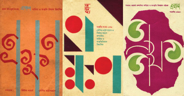
Just what he does with the idea of circle, he plays with the concept of triangles while working on the logo for Sundaram art magazine, edited by Subho Thakur, the nephew of Rabindranath and a brilliant artist in his own right. For its wonderful logo which has the letters placed within equal sized triangles, Ray uses the gestalt laws of similarity and continuation as our mind groups similar elements into collective entities or totalities. However, if we look in depth then we can understand that he also uses reification by colouring the triangles that sits within the letters. These triangles simultaneously use the idea of negative space and also subverts it at the same time by colour-coding and demarcating the triangular spaces. They also look like elongated shadows cast by the skeletal frame of the letter grids.

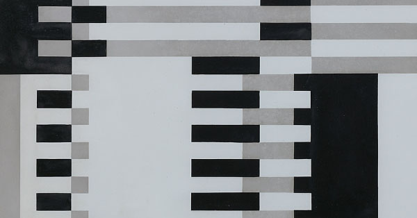
Joseph Albers’ iconic colour grids in The Interaction of Colour (1963) based on Bauhaus principles were a rage in the advertising world of the late 1960s. Albers noted: “In visual perception a colour is almost never seen as it really is — as it physically is. This fact makes colour the most relative medium in art. In order to use colour effectively it is necessary to recognize that colour deceives continually. To this end, the beginning is not a study of colour systems.” To demonstrate his theories, Albers didn’t immediately employ the most garish and shocking colour combinations, but instead began working in black and white. The artist and teacher’s monochromatic paintings illustrated, in very simple ways, how the perception of one colour is altered by the adjacent colour. He studied gradation by producing so-called grey steps, grey scales, grey ladders which demonstrated a gradual stepping up or down between white and black, between lighter and darker shades. If we carefully notice the way the film titles of Nayak evolves with its window like black and white grids, we notice an uncanny similarity of progression in grayscale in both form and tone.


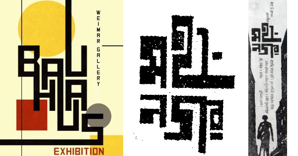
However, a more apt example is the adaptation of Bauhaus typography to Bengali letters in the poster and specifically the newspaper advertisements of Mahanagar. The Bengali letter “Mahanagar” is broken up into two tiers (“মহা”/”নগর”) with one sitting over the other to create a sense of verticality. The letters arranged in this manner instantly conjure up the idea of a cityscape. The long right-angular tail of the letter “হ” provides the horizontal base on which the entire structure is held together. That rests in between a steep vertical space silhouetted by the lonely figure of the protagonist trying to wade her way through that narrow aisle which in turn also comprises of a newspaper column in reality. This meta-play with negative space shows the real mastery of Satyajit. Even it comes to a small bit of work like a one-column advertising in a daily newspaper, he was searching for ideas to play around.
[1] The Society for the Preservation of Satyajit Ray Archives has preserved those
subscribed issues.
[2] Persuaded by his mother, Ray went to study Arts in Kala Bhavana, Santiniketan in 1940, but didn’t finish the stipulated 4-year course. Instead, he came back after two-and-a-half years to take up a job as a junior visualiser in D.J. Keymer, a well-known advertising agency in Kolkata.
[3] Rhomberg, Kathrin, Regina Bittner, et al., editors. The Bauhaus in Calcutta. An Encounter of the Cosmopolitan Avant-Garde. Ostfildern : Hatje Cantz, 2013.
[4] Das, Santi. Satyajit Ray: An Intimate Master. Allied Publishers, 1998, p 27


